Typography 2. class

Before our break Andrew asked us to go off and record the new signage around the LCC campus and ask people about how they are finding their way around. I started researching as soon as I left the room and took pictures of the signs next to the elevator. Later I realized that every single block has a colour assigned to it. The tower block signs are grey, workshop block has blue signs and the design block is yellow. The signage is very clean and subtle it is clear on where to fins which block. I took some photographs of colourful boards, which include signs for different blocks. The wall mounts on which these signage boards are mounted have lots of holes and can be changed quickly. We were told to ask someone about the new signage. I asked a student I didn’t know about his views on the new signage and he was surprised and said he hadn’t even noticed the change of the signage system but that he knows his way around the college and doesn’t really need it to get around. I have to say it took me a while to realize there was a new signage system in LCC but after looking at it more closely, I like it since it is very simple, can be changed easily and is just very clear with it’s simple 3 colours and the clean typeface, which i believe is a thin Helvetica. The student, I interviewed said “I guess the new signage is good since the change isn’t too great and it shows in a simple manner what it’s supposed to.”

Pentagram is the company behind the new signage and they very proudly show it on their website. “Once we understood that the college needed something very simple and functional it was clear to us what we needed to do,” Domenic Lippa.

For this task I have done a form of ethnographic research with an anthropological tradition.

Typography

Tuesday 26th jan

Word’s characters are expressed through visual language.

One should think about shapes and spaces. Negative shapes around and in the letters are significant.

Kerning is the space between each letter in a word. Normally each letter is the same distance as the next but Illustrator and other programs automatically kerns type and pulls it together a bit because of the spacing challenges that sometimes come like a combination of ‘Ty’. One should think carefully about kerning if only displaying one big word.

Lower case letters are easier to read due to the ascenders and descenders.

The FedEx logo uses kerning to create an arrow within the type spaces.

FedEx-Logo

Typeface and font is not the same thing.

Typeface is the name given to a particular language of a typeface.

The font is a specific font that has it’s own name. It is a form of a typeface.

Ligatures are the combination of letters especially in serif typefaces.


Screenshot 2016-01-27 20.27.45

Higher case numbers; proportional lining

Lower case numbers; proportional old style has descenders and ascenders.

Tabular lining creates same widths for each letter without ascenders and descenders.

Tabular old style also has the same widths but also has ascenders and descenders.

Tabular numbers work best in tables although they look a bit clunky in type.
We also learned that:

Speech quotation marks are usually curved.

Primes and double primes are straight apostrophes and indicate feet and inches and should not be used in type.


And two more tips I got from a classmate:
Don’t have more than 12 words in one line.

Don’t leave a single word at the top or bottom of a text. “orphan”

Peroni House

IMG_0310

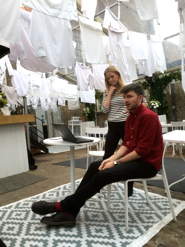
These were the two curators of the Peroni House. They showed us around and explained the ideas behind the ‘pop up house.’


IMG_0311

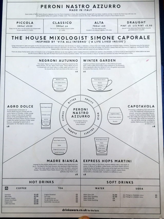
The menus were very well designed and we were told they put a lot of thought into the small design elements. Peroni wants to be a ‘designer beer’ so it’s whole representation is carefully thought of.


IMG_0315

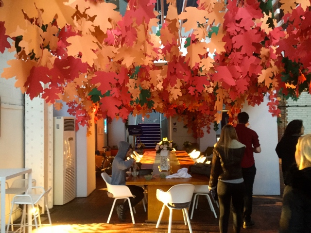
All these autumn leaves were crafted by a paper designer and created quite a nice atmosphere over one of the tables.


IMG_0332

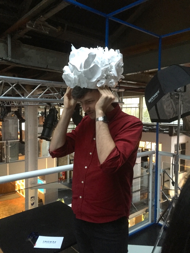
There were also hats and necklaces made by this paper artist for people to dress up in and pose infront of a ‘red carpet like’ Peroni wall. People are encouraged all the time to take pictures and post them online mentioning the Peroni House making it a self advertising campaign.


IMG_0331

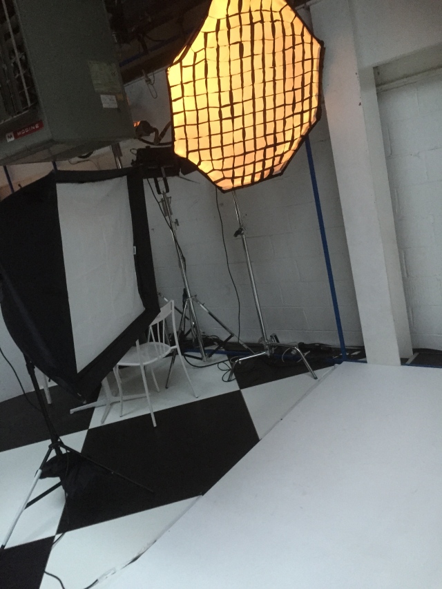
This is the lighting set up infront of the peroni wall.


IMG_0333

All experiences on the first floor are only avalble to people who purchased a ‘key’ including this private dining experience, which you will also have to book ahead and pay extra. It is wrapped in plastic because apparently in italy lots of people protect their furniture at all time with a plastic foil to keep it from wearing down. This dining experience also involves a food fight carried out by actors in the end.


IMG_0339

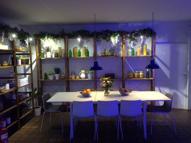
This is also a dining table ‘designed for people to sit around and flirt.’ The whole advertising that it’s a cosy traditional italian space, ‘that your nana would approve of’ seems a bit hard to believe since the blue light makes everything a bit unnatural and the carefully positioned fruit and Peroni bottles give it a rather uneasy atmosphere.


IMG_0340

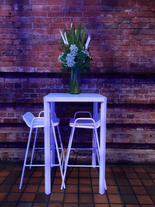
Another ‘flirting table’, standing a little bit alone in the room.


IMG_0345

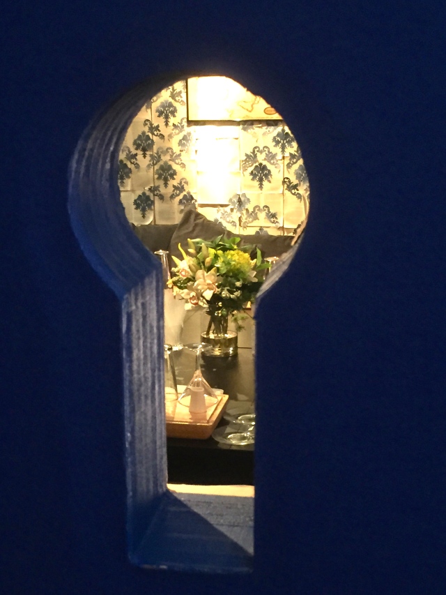
This keyhole lets you peak in another room, which you need a key for. If you pay extra for this experience, you will get a cocktail mixed by a mixologist , infused with Peroni because Peroni wants you to think of their beer as an ingredient rather than just a brew. The reviews I have read don’t sound promising though, describing the cocktails as ‘watered down Peronis’


IMG_0336

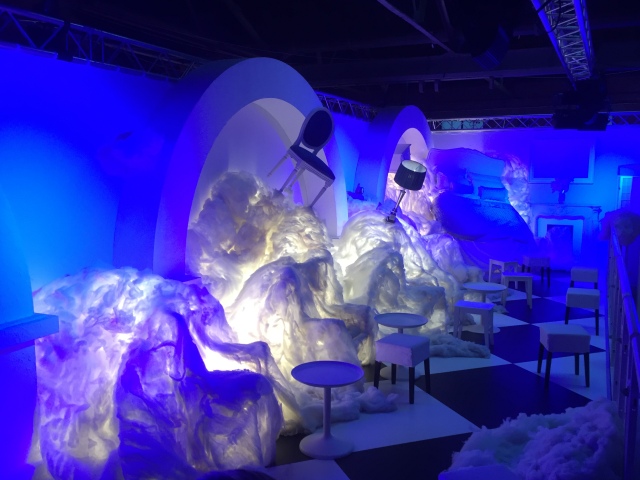
This is another ‘key experience’ on the first floor, called the ‘dream room.’ Each visitor is given a cocktail with infused cotton candy and can then sit around the wonderfully decorated clouds and beds.


Our guide started off by saying ‘if there is one thing you should write down it’s that the purpose of this space is to inspire to live life in Italian style’. Peroni as a brand describes itself as ‘luxfun’, which means they are striking, seductive but at the same time seductive. The target audience for this pop up house was described as the ‘trendsetters of London’ and urbanities, the second place on the ‘hip hierarchy’. Their goal is to be a premium brand and the idea is to defend their ‘premiumness’ in this space, which is free but you will be asked to pay extra for everything that’s fun. In the beginning it was explained they aim for a 70% 20% and 10% distribution in the house making 70% accessible for everyone, 20% tailored experiences and 10% fame driven experiences. From what we saw it seemed more like 60% were tailored experiences. Anyway the philosophy behind this seems to be that if only few people will experience these extras it will give Peroni a lot of PR and it can call itself a premium brand. It is basically a living advert.

I  think the space was interesting to see but since it wasn’t open yet and we got an early tour we couldn’t see it in action. Apparently all the waitresses are Italian actresses, interacting with the guests and professional poets come around and improvise poems for and about random visitors. In action, I believe this would have been a better experience because it was hard to picture the place as warm and cosy as it was promised with the mix of modern furniture, carefully set up shelves and blue lighting around. Also the theme of it being your Italian ‘home’ is a bit disturbed by the fact that families are not welcome with kids. I guess it is just tough advertising an alcoholic product.


Canary Wharf as a private public space

canary wharf.001

canary wharf.002

The first thing we noticed Canary Wharf has it’s own signage that is found nowhere else in London. With a metal sign and distinctive colours it was quite obvious.

canary wharf.003

There is lots of CCTV and one sign said that the scheme is operated by the CITIGROUP, which also has a huge office building in central canary wharf. It is a bit scary that the government doesn’t have power over the surveillance but a big cooperation

canary wharf.005

Not only cameras were around but also megaphones. It felt a bit like in the story 1984 where one person has the power to speak to everyone. It’s a control element, which made me feel quite uneasy.

canary wharf.006

The park was not so much a public place either. The signs in it clearly stated that it was privately owned and that ‘it is no right of way’ so you’re not allowed to use the park as a ‘highway or footpath’ to get from a to b. the park was nicely taken care of but it felt they have the park just so they can say they have a park. There was not a single child playing in there or a family and it didn’t feel like a normal park.

canary wharf.008

The feel of canary wharf is very futuristic compared to central London because every building is modern, built with glass and shiny metal and there are houses shaped like a cut off snake with a huge restaurant in the end. Also the self-driving DLR’s are interesting.

canary wharf.009

There is a contrast in this place with the old dockside houses made from beautiful brick and classic windows. I really like this kind of architecture but sadly it is being used for restaurants, which were completely empty. We didn’t see a single person around those old buildings.

Image

Canary Wharf as a private public space

canary wharf.001

Westfield

IMG_8863_1024

Westfield shopping centre is the perfect example of giving your costumers an experience, greater than just shopping. The whole building is very impressive and modern. The natural light from the glass roof, and the extremely tall walls lets you believe you are not in a building but a big, modern bright new world, that you don’t need to leave. Patrick Vantomme, the head architect and Paul Sutliff did a great job maximizing the ‘dwell time’ of costumers in Westfield; There are countless food stands and restaurant, a big cinema, two gyms, a small kids area and a big ‘kidz world’, as well as massage saloons and resting areas, where one can even charge a phone. There are also barber shops, manicure and make up services, cars are being showcased and you can get a free eye test. The building is designed so people don’t have to or want to leave for a very long time. They have everything from super markets to furniture stores.

barber

barber area in westfield

IMG_8880

resting area

There are two main floors and the first floor has lots of balconies and open spaces, letting natural light shine to the bottom floor and creating a free, ‘airy’ space. Also the costumers see more shops at the bottom floor.

A few more examples of the experience economy you can find, are for example that the children’s play area was surrounded by children’s shops like lego or other toyshops and loads of clothing shops for very small kids. Also the play area had a sweet shop on one side of it and a donut stand on the other. I am guessing the children are encouraged to have a sugar shock so they want to stay longer and get their mums to buy more toys. Another good example, which got me hooked was that they had a new electric car being showcased and you could sit inside, watch YouTube videos on it’s screen and ask questions about it. I sat in there for a good 10 minutes but did not buy a car in the end because of financial reasons. I came there to buy new trainers and most of the sports shops were very impressive how you could design your own sneakers and try them out on a running machine.

IMG_8907 IMG_8846

There is a ‘fancy’ part of Westfield, where all the high-end brands are located. You can see the difference in design on this photo. The mall transforms into a fancy, darker light, luxurious shopping street only that chandeliers are hanging from the ceiling.

IMG_8890

Westfield is definitely designed to maximize consumerism. For people who have never been there, they may be impressed by the surface design but they are actually affected a lot deeper as well. There are no start-up shops in the whole shopping centre, only high street brands, which makes the average shopper feel very much at home and comfortable with the ‘trusted big brands’. Also all the people working for the mall have a subtle universal uniform, insuring security and help if needed.

CTS: BLEACHED DREAMS AND TROUBLING PLACES

04

In this lecture we were taught by a very nice German lady about the simulations of other worlds.

Macdonadisation was explained as a place created for people to consume quickly and leave whereas the opposite, Disneyisation is like Disneyland, a place that attracts people to stay as long as possible and forget time. Casinos are designed in a way that people forget what time or day it is and spend as much time and money as possible.

In the USA, there are whole towns designed for consumerism, where there is a mall in the town centre and all the roads lead there and even the highway passes the focus point of consumerism.

Also in discussion was that places like airports or supermarkets are described as ‘non-places’, which are places missing memory, history  or even emotion. It is a place where you spend a set amount of time and aren’t supposed to make an emotional bond to. These places are very clinical, clean and the often simple design is supposed to appeal to most people. They are stripped off personality and identity and purely exist for a purpose.

The last subtopic we talked about was simulations;

SIM·U·LA·TION

(sĭm′yə-lā′shən)

n.

1. The act or process of simulating.

2. An imitation; a sham.

3. Assumption of a false appearance.

NASA uses simulations to train their astronauts before moon travel for safety and training reasons because there is no other way of gaining experience in that field. There are many philosophers, that have looked into simulations and criticise them. Also there are many movies, which touch on the virtual world and how thin the line must be one day between virtual reality and real life. Example of movies include ‘the truman show’, ‘the wall’ and ‘existenz’.